CarPlay is Apple’s solution to automakers’ generally awful infotainment efforts in their cars, trucks and SUVs over the last ten years.
iOS 13 is Apple’s latest phone software, and because iPhones are what runs CarPlay, CarPlay is updated and thus improved. It was released about a month ago, so we’ve had time to experience its changes, improvements, and in some cases, frustrations.
Loves and Hates
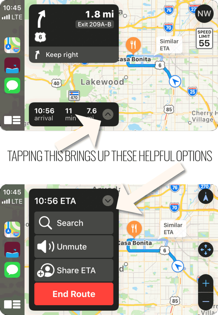
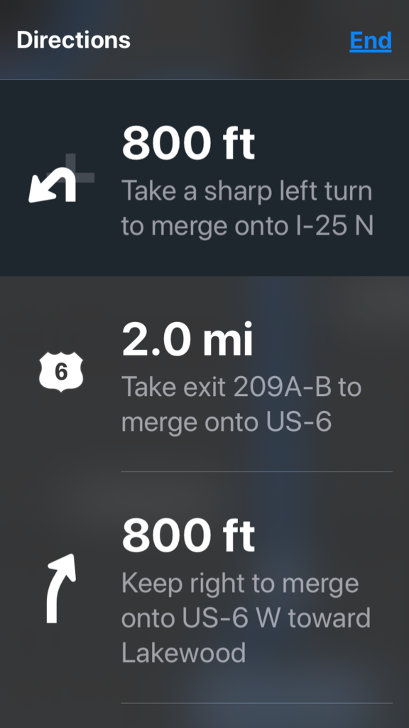
- There’s no way to End a trip in Apple Maps from the main Maps screen (not Dashboard) — you have to go to the phone itself to find the red End button.
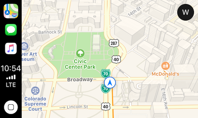
- The overview/detail button in Apple Maps isn’t clear, and usually doesn’t work. Sometimes it’s a compass arrow, sometimes it’s a squiggly, in all cases it’s either laggy or doesn’t do anything. See photo below.
- The new dashboard is nice, not mind-blowing, but nice.
- More controls have been “surfaced” up to a single tap from the top-level. See photo below.
- Siri still doesn’t do much for me. She’s just a nice-sounding interface to static information.
- The improved interaction of Calendar in CarPlay is super.
Changes in iOS 13 CarPlay
- CarPlay is now five years old!
- Do not disturb while driving shows a moon icon near signal strength and battery level.
- The secondary display — your iPhone itself — remains unchanged in the various configurations we’ve tried it with.
- Siri is not in this list of changes despite what Apple says.
When Will Siri Show Up?
When will Siri show up as an intelligent, AI-powered feature that predicts things we consider truly useful? She’s still a basic assistant who is simply an intermediary between your daily business and you. She just looks up stuff you could find with a quick look at your calendar, your messages, your email, etc.
Wake me when Siri is an actual AI, one that predicts your needs and offers you useful information before it occurs to you to find it. My test for this behavior milestone is when Siri offers me information that I say “I didn’t know I needed that.”
Photos of CarPlay — iOS 13
Dashboard
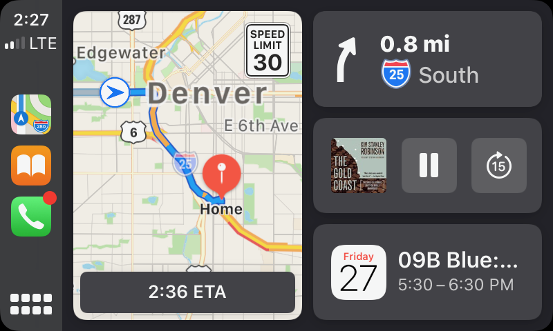
Apple Maps in Dashboard
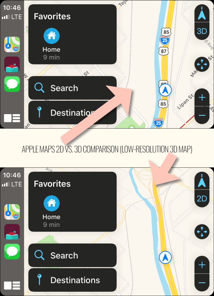
2D vs 3D Maps
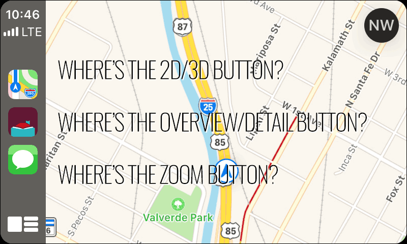
Secondary (iPhone itself) Display


1 Comment
[…] release of iOS 13 on September 19, 2019 bought several new features and enhancements to CarPlay. Most importantly, iOS […]